Prepare for Your Next Breakthrough by Prioritizing Self-Care
May 26, 2020Why Direct Mail Marketing is a Brilliant Investment
June 9, 2020Pack Extra Meaning into Your Message with Strategic Color Combinations
Of all the elements of design, color is probably the most challenging to understand.
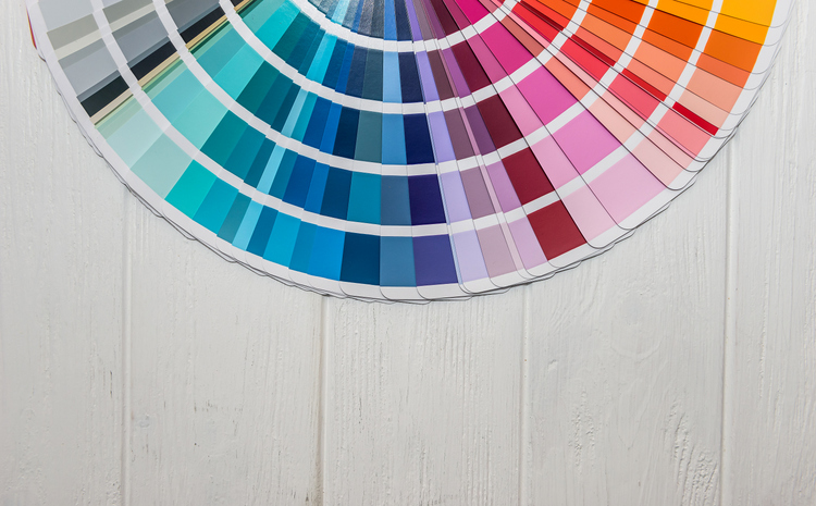
Color originates from a light source that is viewed directly or seen as reflected light. While colors can be displayed in spectrums, prisms, or contrasts, the power of colors is not only in their arrangement, but in the way we perceive them.
Want to add depth to your message? The colors you choose can add an extra layer of meaning.
Colors Prompt a Specific Response
According to Sally Augustin from Psychology Today, research shows that particular colors can prompt measurable responses.
Here are the impacts of five particular colors, and how you can use them to your advantage:
Green
Seeing the color green has been linked to more creative thinking—so greens are good options for pieces featuring innovation, creativity, artistic specialties, or proactive growth.
Red
People featured in front of red backgrounds are generally seen as more attractive when silhouetted against other colors, so reds are great for photo backdrops, booklet covers, headshots, and more.
Having a red surface in view also gives people a burst of strength, so reds are good choices for concepts related to fitness, acceleration, competition, and courage.
Violet
People tend to link greyish violet with sophistication, so these hues can be a good selection for places where you’re trying to make a stylish impression.
Try subtle violet/grey hues in designs for home apparel, personal products, product labels, and more.
Yellow
Yellow is associated with joy, happiness, optimism, and energy.
This color stimulates mental activity and generates muscle energy. Yellows are great for stimulating appetite, implying freshness, or for conveying warmth. Yellow also screams for attention, so you can use it to grab interest. Avoid overdoing it by adding yellow in contrast with another color.
Blue
Did you know that people are more likely to tell you that blue is their favorite color than any other shade?
Blue is a great choice for design, especially with so many shades to choose from! Nature-themed blues can call forth feelings of calmness or serenity, and are perfect for striking a tranquil tone. Turquoise or royal blues can project stability and reliability, which is strategic for brands that want to communicate productivity or security.
One caution about blue: it is not very appetizing. In the world of cuisine, humans are geared toward avoiding blue as it is often a sign of poison or spoilage. Some weight loss plans even recommend eating your food off a blue plate to squelch hunger!
Color Your Communication
Color is a powerful communication tool and can be used to signal action, sway emotions, and even influence physiological reactions.
The right use of colors can play an important role in conveying information, creating moods, and influencing the decisions people make. Be strategic and add extra meaning to your message with dynamic, powerful color combinations.

