
4 Nonverbal Communication Hacks to Streamline Your Success
August 27, 2019How to Build Unity in Your Team on Three Critical Levels
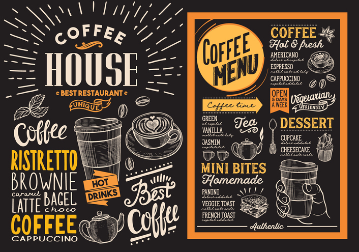
September 3, 20195 Smart Strategies for Fantastic Font Selection
Want to win in print? Let’s talk text.
While fonts are a crucial part of one’s design, often fonts are given merely a passing thought. However, good typography expresses personality, increases readability, and displays professionalism, ensuring your print ad delivers the right message in just the right tone.
Fonts can mark a clear difference between a piece that is awkward and amateur versus one that is sleek and professional. Don’t fast-forward through this crucial element in your project design!
Increase the Impact of Your Print Piece with the Right Font
Here are five things marketers should take into consideration when choosing the right font.
1. Readability
The most critical factor in font selection is readability.
If people struggle to read your text, they’ll probably pass on your business. Remember, script or decorative fonts are usually more challenging to read, especially in large blocks. Increasing font size and spacing between lines increases readability, whether you use simple or decorative fonts. If you aren’t sure of the best format, try several drafts and poll friends to get an objective viewpoint.
2. Instant Impact
Design, including fonts, is key to a consumer’s brand assessment.
Did you know that 72% of consumers say packaging design definitively influences their purchases? Using multiple fonts can enhance your message and captivate consumers, but don’t get carried away.
Choose fonts that compliment rather than compete with each other. Try a decorative font for a logo and a traditional font for the body copy. Or try a large, bold headline with a subtle script tagline. Logo fonts should act as an accent piece to reflect your company’s personality but use these fonts sparingly in other copy.
3. Emotional Connection
The height, curves, or angles of lines can resonate with consumers in ways you might not expect.
Take the New York Times, for example. This media giant has tried several times since 2003 to change its font and modernize its image. Each time, the paper received backlash from readers who felt upended at the deviation from what they had known and loved.
Over time, your font can become as much a part of your brand as your tagline or logo. Make an enduring, sustainable choice, and you may be surprised how it takes on a life of its own!
4. Target Demographic
To really hit home, remember your font should immediately click with your target audience.
For example, a stodgy, narrow font may work well for a cigar box but would seem clumsy for a children’s playground carnival. When beginning a project, ask yourself, “where and how will consumers read this information?” Aim for the customer, and you’ll find greater success.
5. Brand Goals
What is the overall image you want to project? Fun and playful or sleek and simple?
If you’re looking for something traditional, formal, or elegant, a serif font is usually best. If you’re aiming for a modern, sharp, or minimalist look, try sans-serifs.
From Font to Fantastic
Fonts choices have a subconscious impact on how customers process and receive your message.
Push yourself to think contextually when it comes to fonts, seeking out those that will best connect to the culture, age, or the location of people you are trying to reach. Carefully attending to these details can make a difference that lasts for decades!