3 Simple Resets to Squash Stress at Work
April 2, 2019Use Short Deadlines to Get Lasting Results
April 10, 20195 Elements of Stunning Letterhead Design
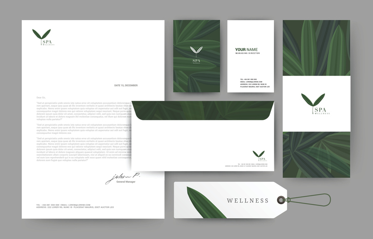
Personalized mail is a special commodity these days, especially something that looks smart or sophisticated.
And everyone agrees that there’s a huge difference between a typed letter on a bland white page and one aligned smartly on a beautifully designed letterhead.
While many view letterhead as an afterthought, it’s time to raise the standard!
A sharp letterhead can communicate proficiency, increase response rates, and make your communication more memorable. As you craft a unique, professional look, here are some elements to help you cement your image without overplaying your hand:
1. Embrace Simplicity
One of the guiding principles of letterhead design is to make it flow simply.
While it’s important that your letterhead looks and feels great in the hand, it should still play second fiddle to the communication itself. If designs are too bold, you run the risk of competing with the page content to demand reader attention. When in doubt, simple is best.
2. Represent Your Brand
Letterheads present companies with a great opportunity to represent a brand with sharp fonts, crisp logos, and subtle borders or shading.
Look for ways to draw the designs of your website, envelopes, and letterhead into a more cohesive unit and add some extra depth to your marketing mix. When trying out size contrasts, try to balance the shape of your images with the offset to create a connected design.
3. Don’t Be Afraid of White Space
Like silence between musical notes, a break between elements communicates elegance and ensures a quality user experience.
White space is not “wasted” space, instead, it balances elements, organizes content, and creates spatial proximity so your readers can digest information quickly and simply. Use generous amounts of white space between a large heading and a block of subtext. Or experiment all text flush left or flush right to create more white space between margins.
4. Use Colors Wisely
On printed letterhead, nothing communicates like color.
Use color strategically to draw attention to specific areas of your letterhead, or to add subtle shading to a more grayscale design. If your brand features bright and bold colors, it may be best to use color sparingly in the letterhead but more prominently in your envelope design or packaging. Color can make or break the success of your design, so tread lightly.
5. Don’t Overlook Details
The most critical information to communicate in letterhead is your contact info.
Who is writing the letter, a company or an individual? Decide which pieces of information are critical and build your design around this hierarchy. Keep key information obvious and reduce print size for lower priority info. If you are updating designs or re-ordering, take a fresh look at your materials. If the company you are sending to no longer utilizes a fax machine, perhaps it is best to omit this number. If your organization is larger, consider tailoring several letterhead designs to specific departments.
Letterheads remain an integral part of a brand’s marketing mix. Inject new energy into your designs with thoughtful layouts, creative contrasts, or complementary envelopes that keep your messages stand out in a crowd!